Reynolds Wrap
Packaging | Logo redesign
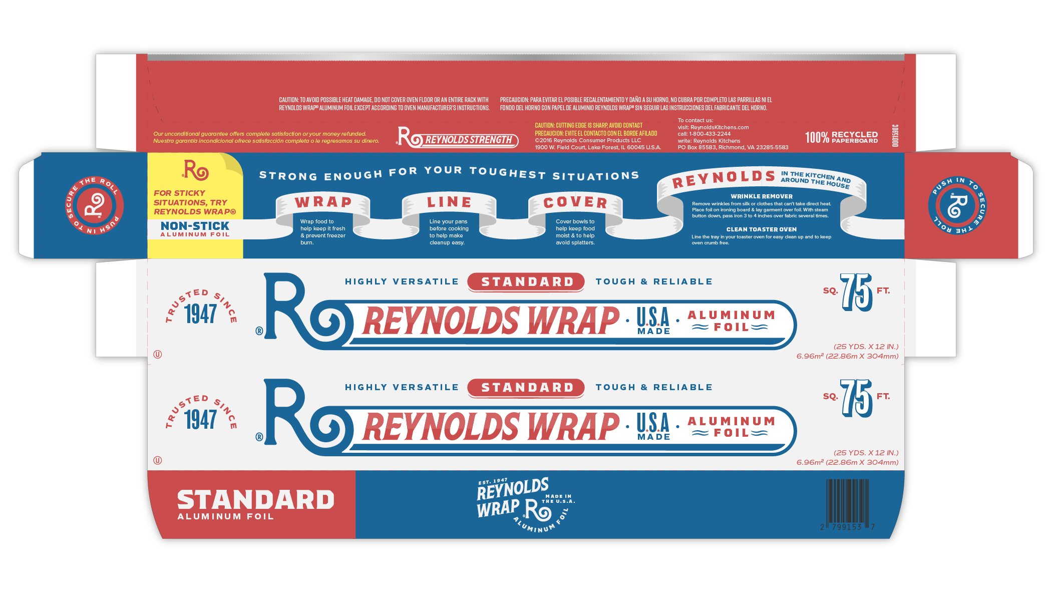
Reynolds Wrap is a line of kitchen essentials created by Reynolds Consumer Products, famously known for aluminum foil. This packaging concept explores updated typography, layout, and colors without straying too far from the original look in order to maintain brand recognition and customer loyalty.
The serif fonts add a touch of vintage style to the packaging as a way to showcase the brand’s decades of experience. Alternatively, the logomark takes inspiration from roles of aluminum foil and offers a more literal representation of the product without sacrificing simplicity or legibility.
Previous Colors
Updated Colors
Reynolds Wrap has been trusted for over 70 years and is made in the U.S.A. With their original colors already so close to red, white, and blue, it only made sense to model them closer to the colors of the Nation’s flag. The gray was lightened in order to increase contrast between the colors.
Logomark
Complimentary Recipe Card
Other varieties can easily be distinguished by the different color blocks and labels on the cover flap.


